Spring Health
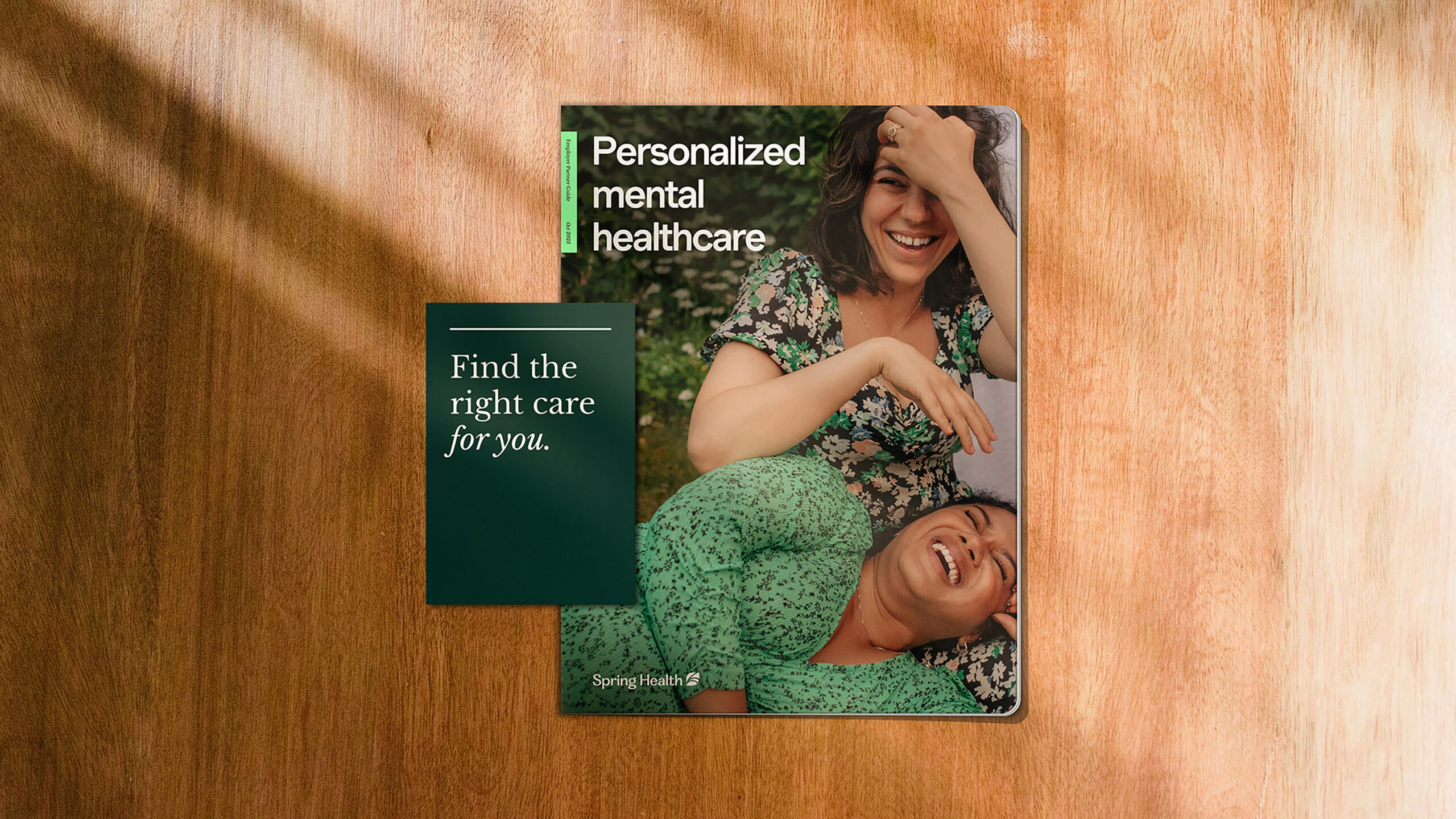
Spring Health was founded with a clear goal: to make mental healthcare accessible and beneficial for everyone, regardless of background or current situation. They achieve this by matching clients with qualified professionals who can provide personalized and effective solutions.
Our challenge was to create a unified brand identity that reflected the balance between expertise and warmth. The key was to bridge the gap between their data-driven, clinical approach and their desire to be approachable and empathetic. This would build trust with a wide range of potential clients.
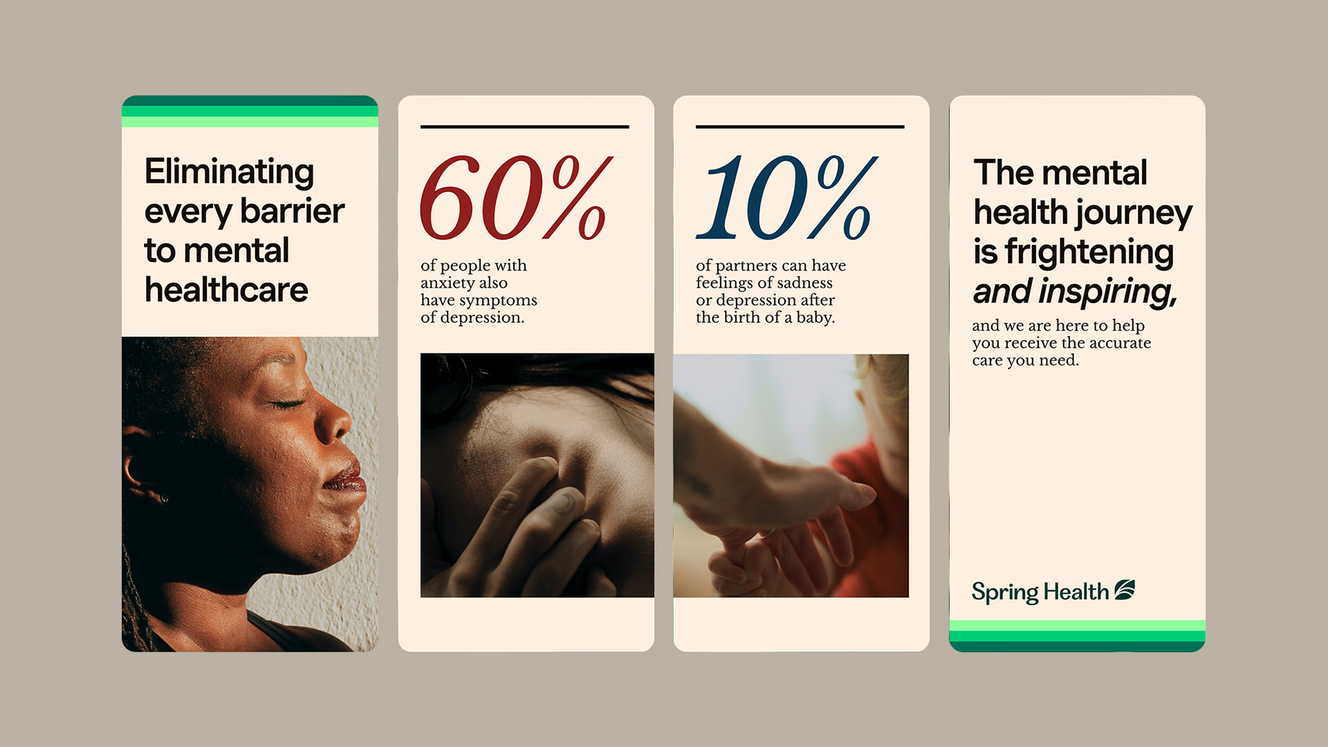
Our solution was a brand system that evokes feelings of security, connection, and determination to move forward. The core concept is “precision with humanity,” which reflects Spring Health’s commitment to both effectiveness and compassion.
With a close collaboration with their internal team and the foundry Dalton Mag, we developed a custom wordmark and a symbol that captures the ideas of listening, growth and new beginnings.
We also developed detailed art direction guidelines, a versatile library of graphic components, and a carefully chosen color palette. These elements work together to communicate Spring Health’s honest and engaging brand story. This story openly addresses mental health and emphasizes its crucial role in overall well-being.
Strategy
Identity
Assets and guidelines
Motion
Agency: Moving Brands
Team: Sarah Agnone, Lee Brotherhood, Jemma Campbell, Cindy Wu, Jea Hyunn Reece, Joey Nanni, Scott Sanders


